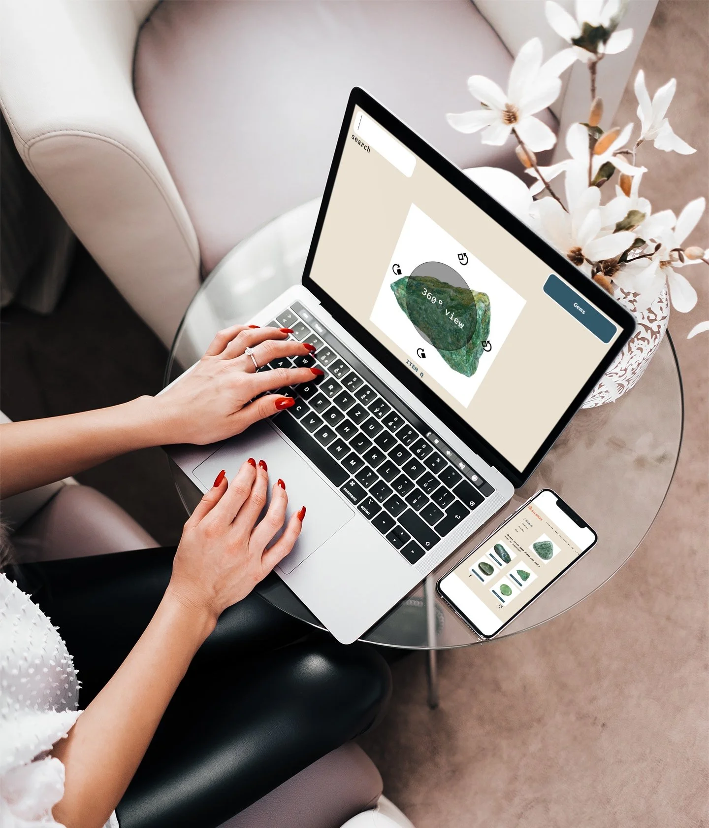
A Case Study
E-commerce Function for a Rocks and Minerals Store
Role:
User Researcher, Product Designer, User Tester
Tools: Miro, Figma, Whimsical
Timeline: 2 week sprint
Overview
STL Rocks carries a selection of carefully curated crystals, rocks, fossils and sterling silver jewelry from all over the world. Each piece is unique, making it a perfect gift for anyone.
Buying rocks, crystals and jewelry is not the same as buying other consumer products. With each item having its own individual shapes and markings, each customer walks away with something unique.
Therefore, when building an online shop for STL Rocks, we had to consider this buying experience, unique to rocks, into our shop.
Understanding the Problem
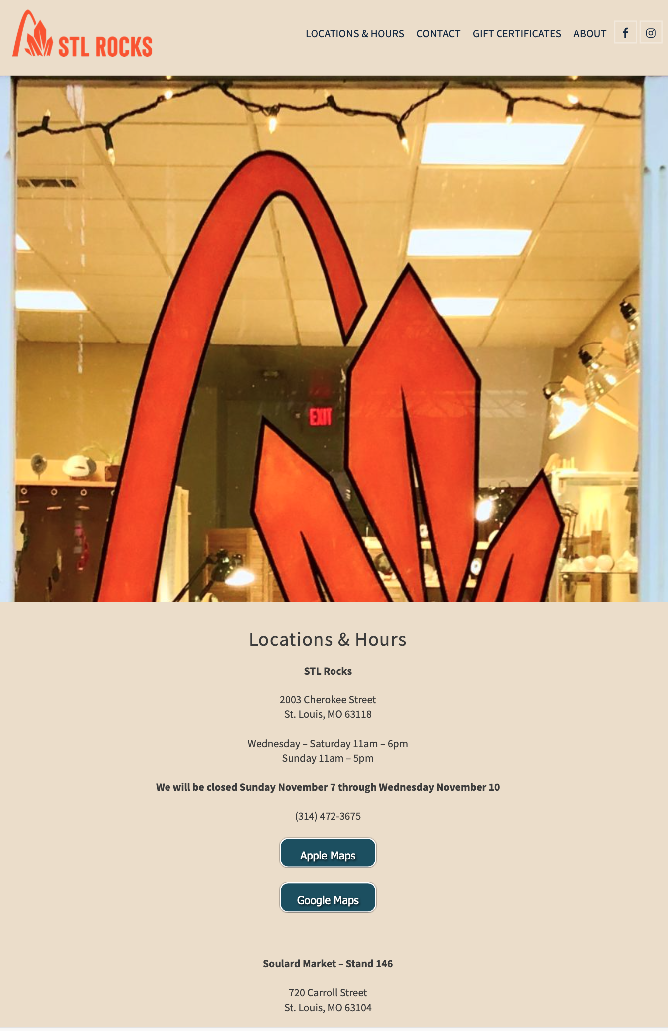
Aside from not being set up for e-commerce functionality, the current website needs some structure. Currently it is only one page, with a top bar navigation that scrolls down to different subcategories: About, Locations, Hours, Contact, Gift Certificates, and social media links.
Research
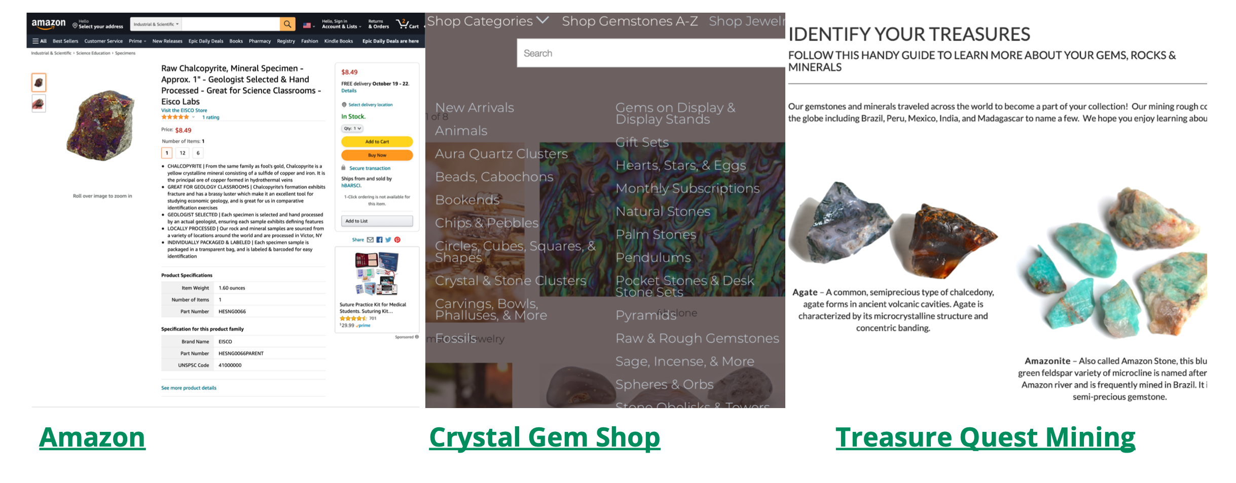
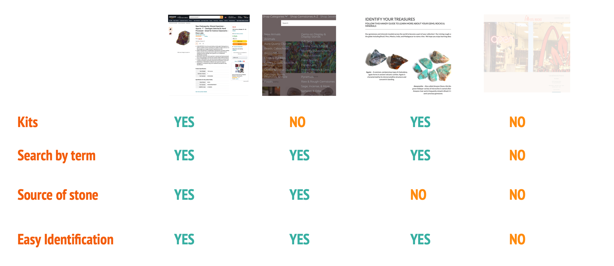
In order to assess how customers shop for precious stones online, I looked at three competitors: Amazon, Treasure Quest Mining and Crystal Gem Stone Shop.
Through the initial analysis, I was able to identify ideal descriptive terms used, highlight defining features for an item, and walk through the packaging and labeling flow used in the careful delivery of each delicate treasure.
All of these insights helped me envision the design for the STL gem store.
To learn about how customers shop for precious stones and how they currently look for in their shopping experience, I conducted user interviews.
The initial survey allowed me to seek out participants in my study who were current gem and precious rock explorers and/or collectors. The interview questions I asked were aimed at filling in any gaps about the person’s experience at a gem store and to help me understand and learn about the problems that people have with finding and exploring rocks and minerals.
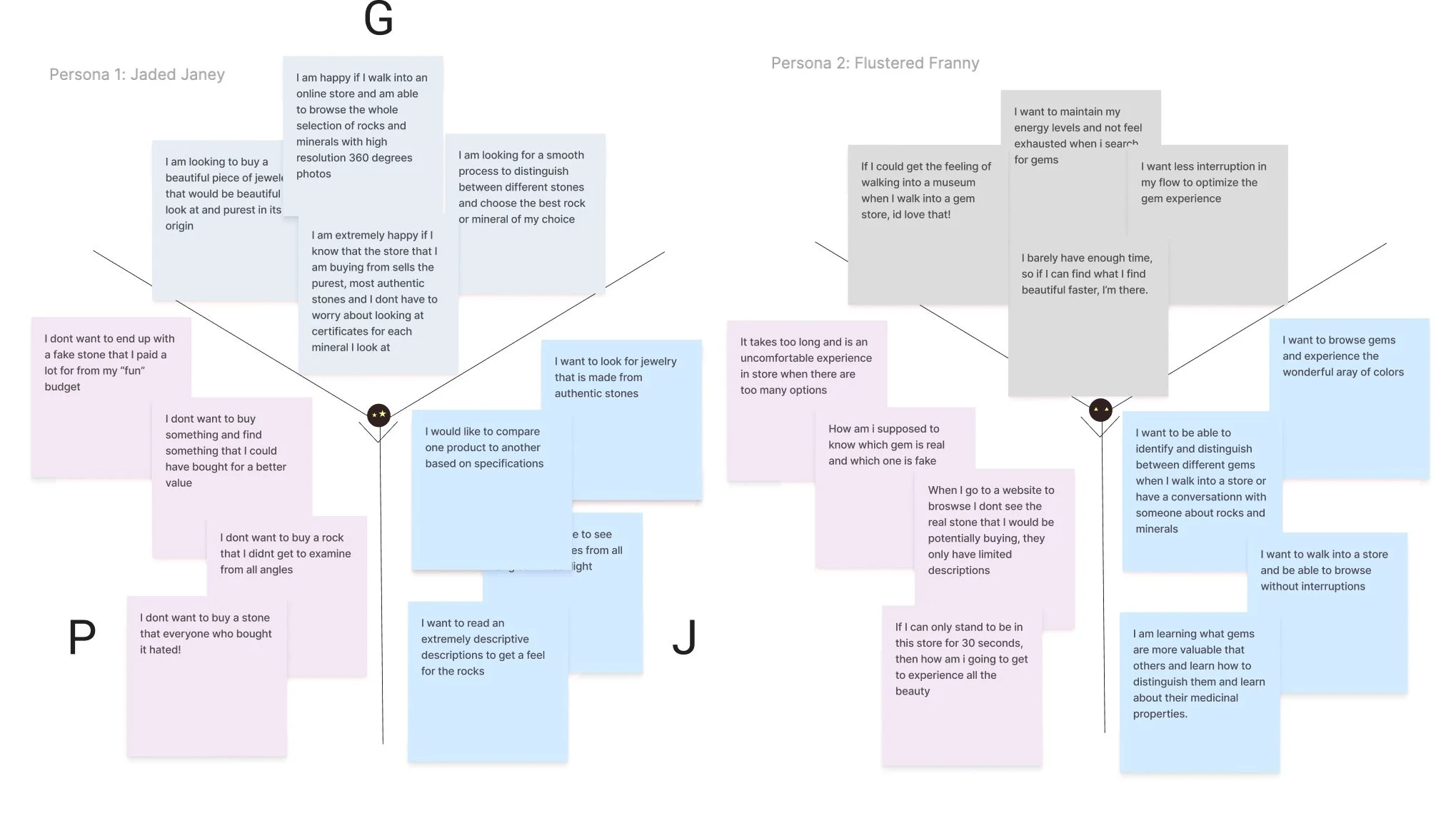
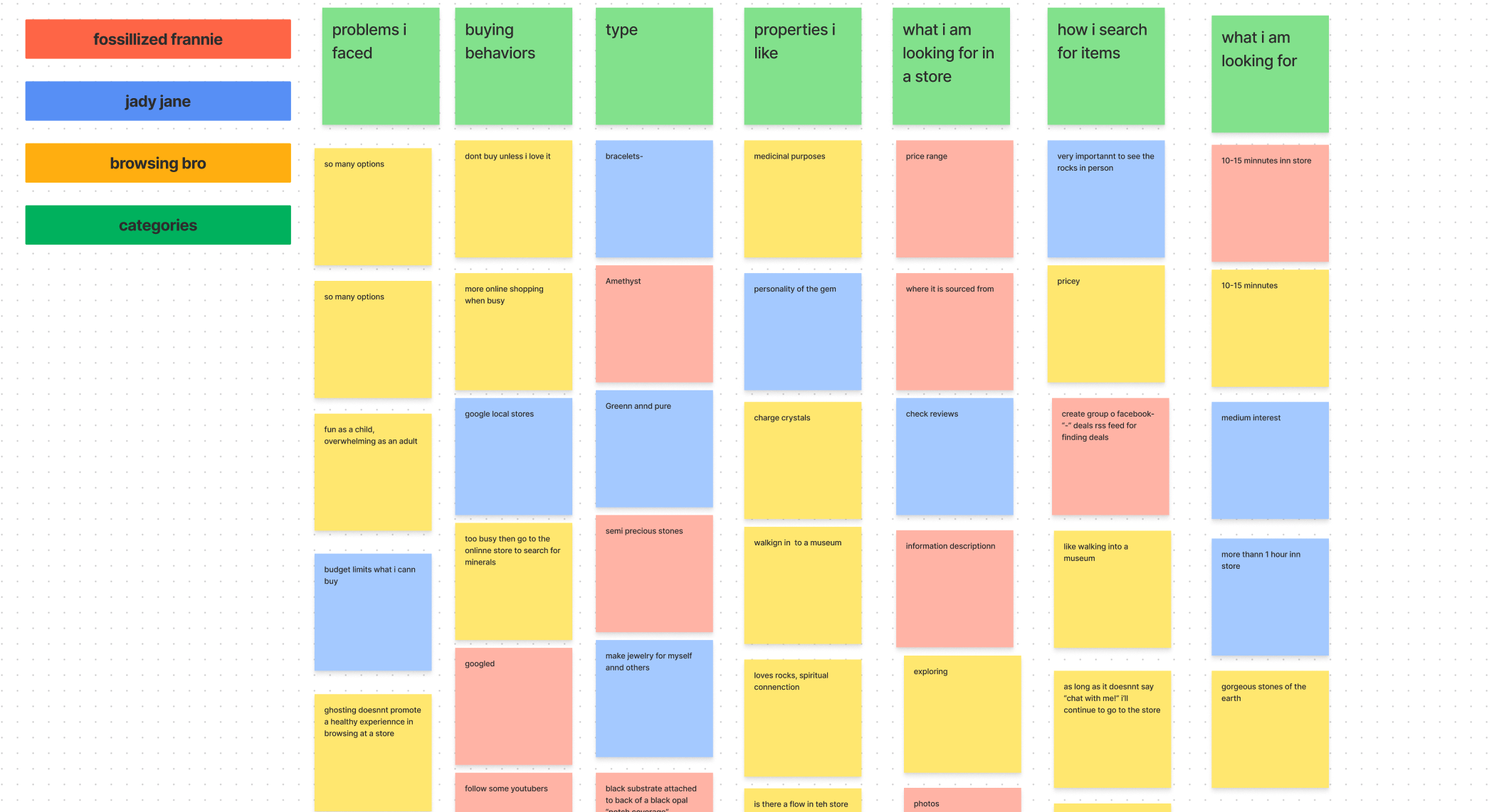
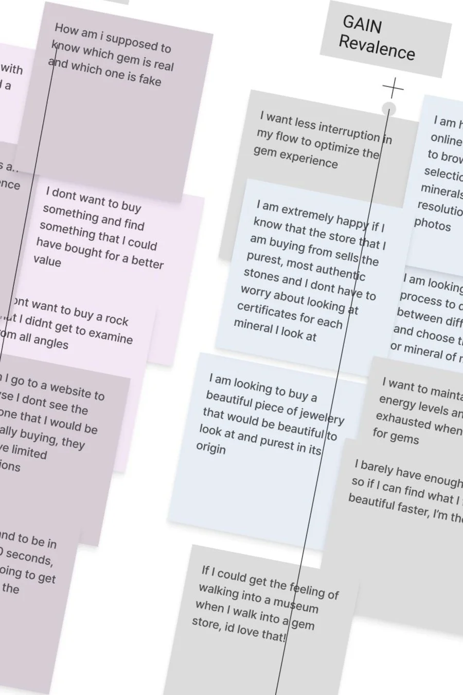
Using the insights from the interviews, I assembled an affinity map to pin point themes and commonalities in each user’s experience in a gem store. Further, I mobilized the insights from the affinity maps into a Gains, Pains and Jobs chart.
What do users want to achieve in their shopping experience? What obstacles exist in accomplishing the tasks they are trying to get done? What key jobs need to be achieved expressed in their own words?
Additionally, testers were given access to a card sorting forum (Optimal) to take part in an open card sort activity which generated a sample list of inventory representing the breadth and range of merchandise sold by STL Rocks. Participants categorized items in the way that made sense to them. This helped me create the site map for the website’s e-commerce function based on comparable categories of items grouped together.
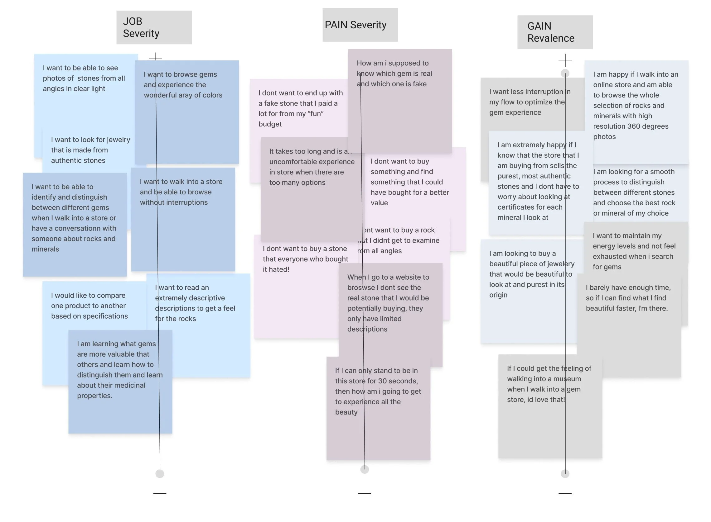
After analyzing competing online experiences and talking to regular buyers about rocks & minerals, I distilled my observations into a singular problem statement…
“Buyers need to find unique, authentic pieces that best match what they're looking for. They want to discover options without too many overwhelming choices.”
Meet the Personas
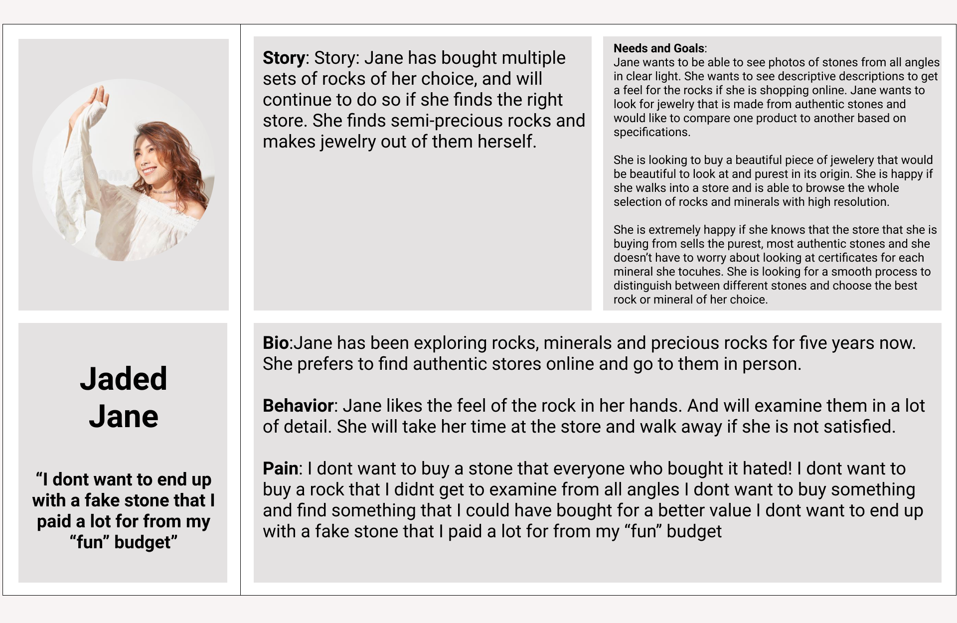
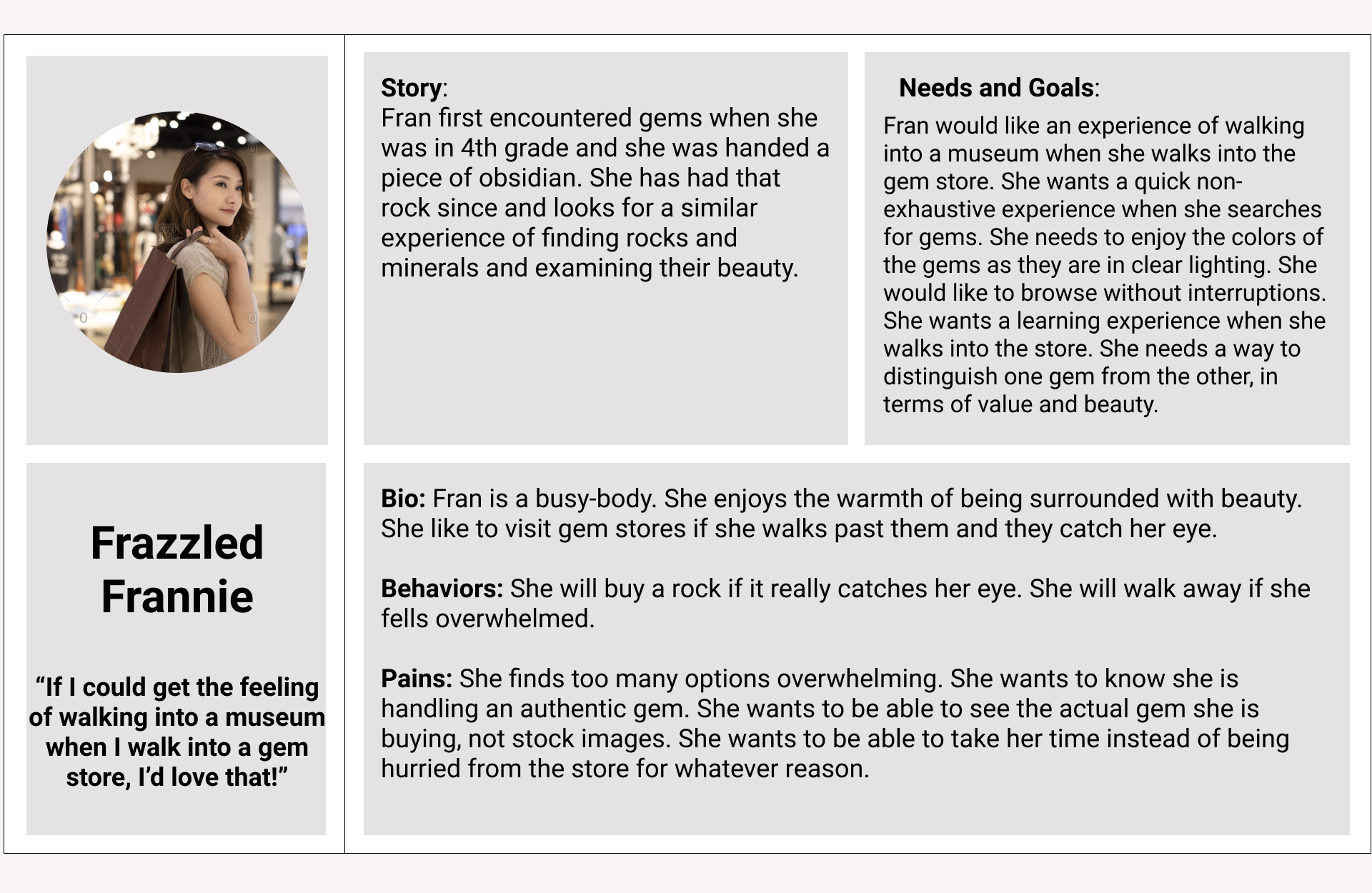
In order to empathize with end users and create understanding, Jaded Jane and Frazzled Frannie were born. These two personas helped me gain a perspective similar to the user's. I stepped outside of myself and recognized the different needs and expectations people have.
While customers, Jane and Frannie are very different kinds of buyers, they both have this problem.
Jaded Jane, the gemthusiast, has been buying rocks & crystals for years. She knows all about different kinds of gems, and knows what she wants. She wants to know that the items are genuine, where they are from, and that they were ethically-sourced.
Frazzled Frannie, the rocksplorer, is new to this world. She’s immediately drawn to the colors and shine that a gem store promises from a glance but walks away empty handed most of the time, due to too many choices.
Customers want Assurance and Clarity.
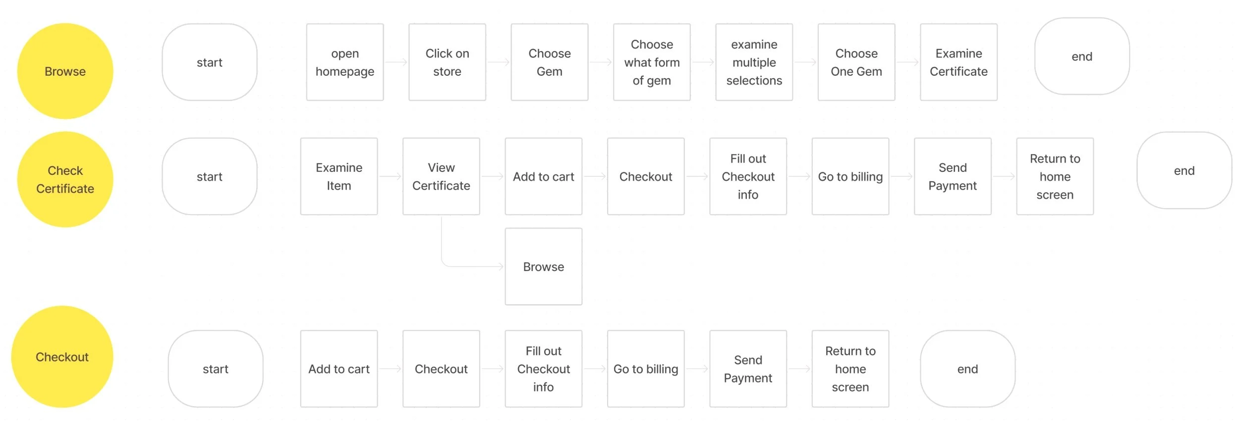
To understand and help me create the ideal shopping experience for a STL Rocks customer, I created a user flow to display the complete path a user takes when visiting the STL website, and another flow to show how a shopping experience for a potential customer would look like. From this I learned more about distinct mental models of each potential customer.
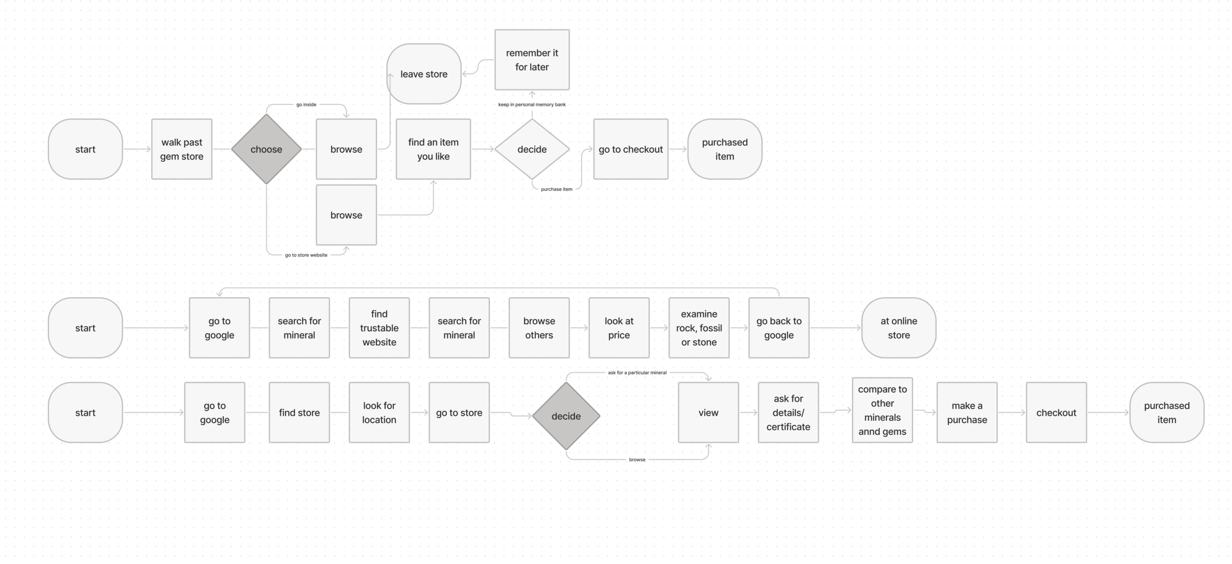
Clarity Mindset: Buyers need ease of accessibility to finding type, style, cost, and description of an item so that they can find what they are looking for. Potential customers can be thwarted off by the plethora of options available to them.
Assurance Mindset: Customers don’t feel safe expending their pockets to buy stones if they are not sure they are authentic items.
Here’s our solution
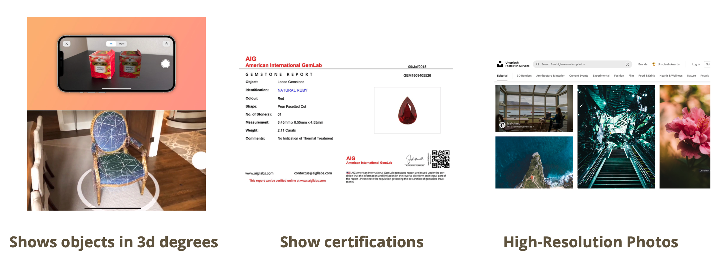
A new e-commerce function that will be added to STL Rock’s website to showcase their products through a minimalistic design and easy filtering process and provide authentic high-resolution images and certificates for each stone.
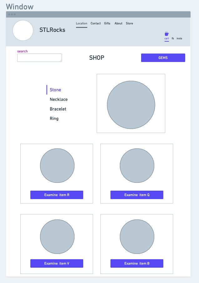
A clear navigation and filtering process
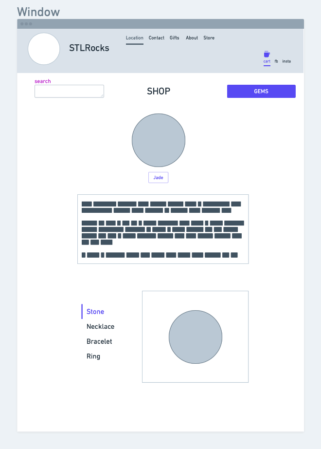
By allowing the buyer to easily find their gems of their own choice through a process of easy filtering, we have liberated the buyer from being overwhelmed in their shopping experience. Users select a stone (ex. jade), a product category (ex. ring), and then identifying their own unique stone. We have built the STL Rocks online buying experience around the natural way people go about buying precious stones.
Certification that provides assurance
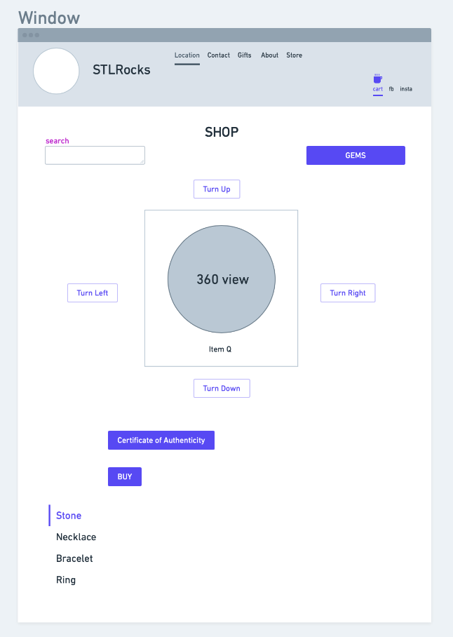
The Certificate of Authentication is provided for each rock and signed off by an expert allowing potential customers to feel safe in their buying choice and expending their budget. Also, users are able to view a 3D model of their unique rock, further providing them assurance in the buying process
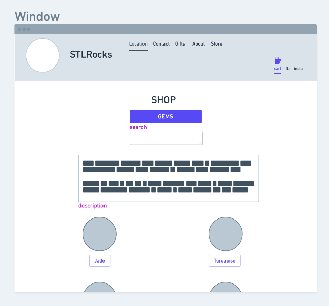
Sketching and Wireframes
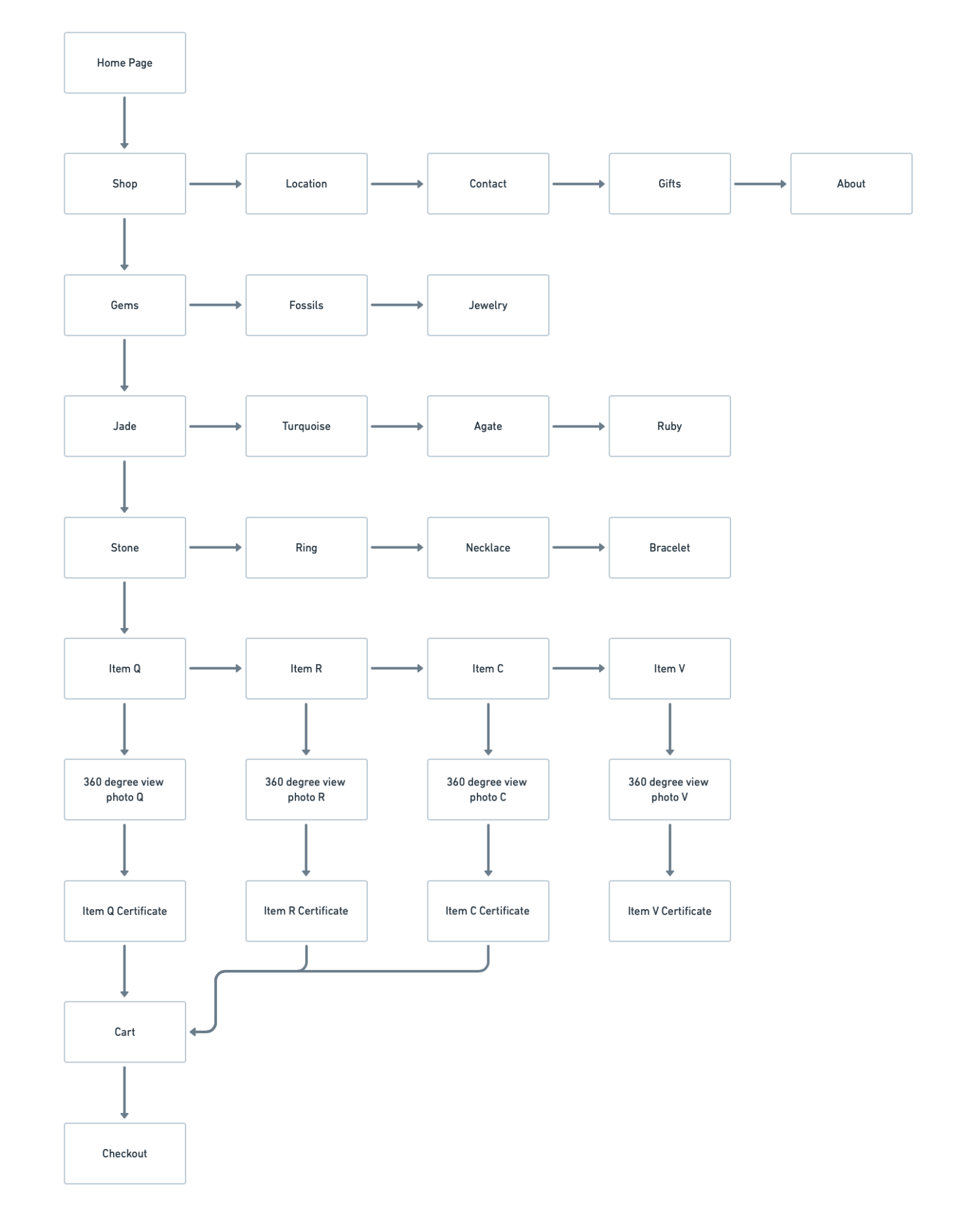
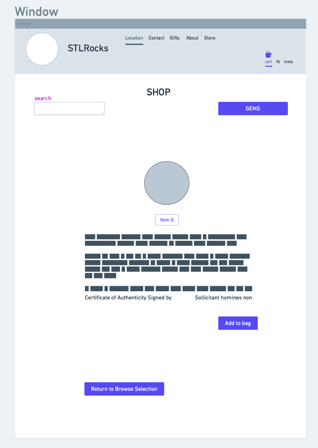
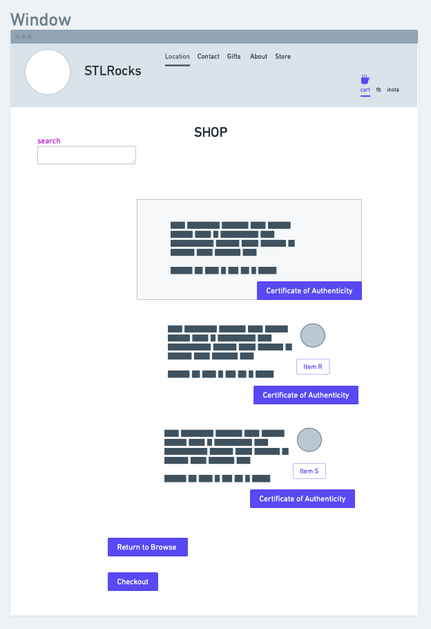
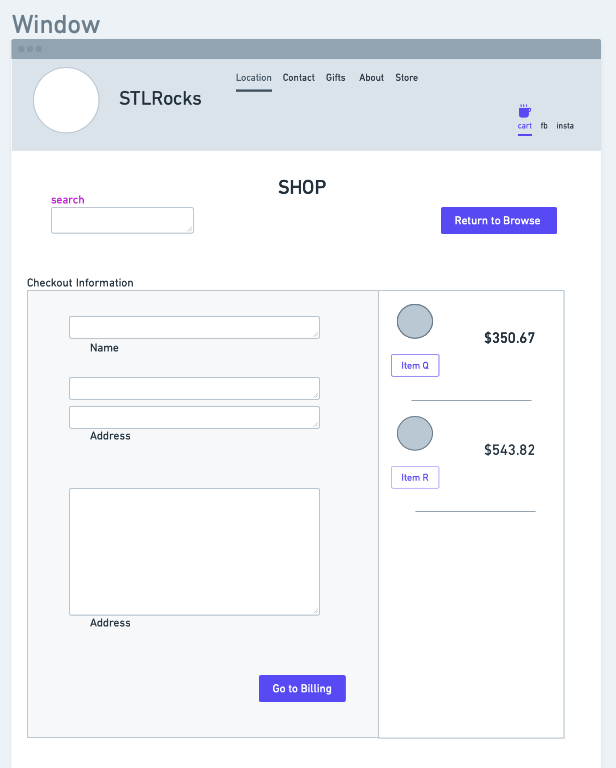
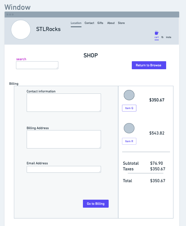
Using insights from the research phase, I was able to classify types of merchandise and create a sitemap for the website.
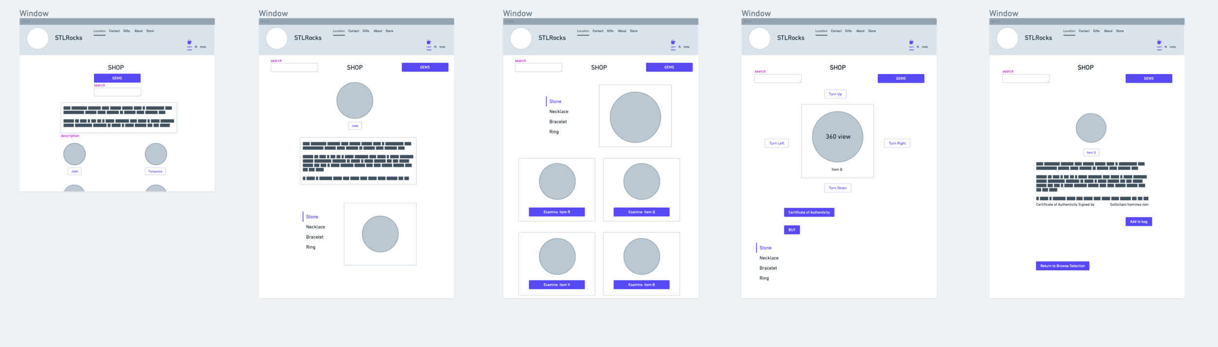
Sketching ideas for the new store allowed me to efficiently visualize the ideal design, and through multiple iterations I came up with one that worked!
These low fidelity wireframes were just the beginning.

Final Deliverables and Next Steps
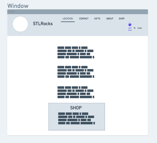
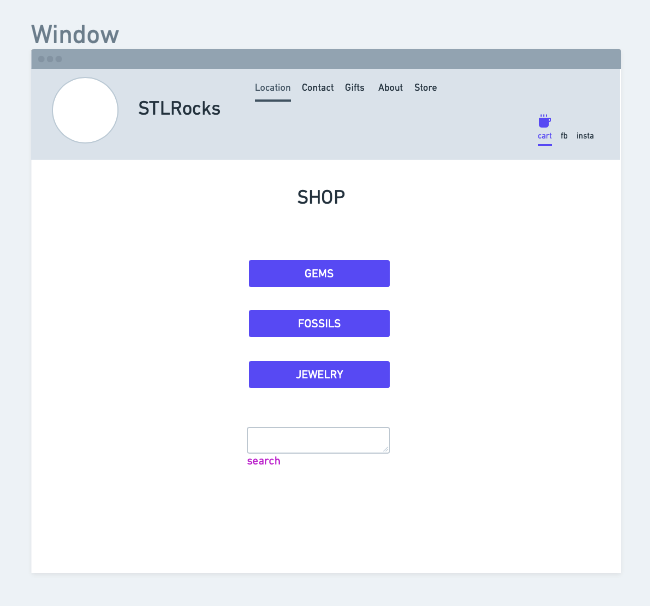
I moved on to creating higher fidelity wireframes using Whimsical which I translated into Figma. I prototyped these frames and tested our features.
There were some problems with the prototype, which I was happy to iterate. Once the prototype was updated, it was ready to be sent out to be tested again. Our users were much happier this time.
Users were tasked to perform three tasks:
Browse categories of Jades and identify distinct features in a gem by looking at a 360 degree photograph of the item
Choose an item and take it to checkout in one smooth flow
Verify certification of a particular stone
After the usability test results some gem placeholder images were changed into item images, text which represented as buttons was replaced with clearly discernible text boxes, and we added the search tool to help users find items they may or may not be familiar with.
In future iterations of the store features, some updates to improve user experience include user higher fidelity prototypes, includes a checkout flow as an addition to the assurance flow, and offer more options in preferences for the charity flow. Further research needs to be accumulated to thoroughly understand the user, with bigger test groups.
I created an online store for STL Rocks inviting more potential customers to experience the gemstacular experience. I’ve designed the experience around how customers currently shop for gems and jewels.
We’ve successfully provided assurance for our persona Jade, and now she can comfortably shop for gems knowing they are genuine and sourced ethically.
We’ve successfully addressed our Persona, Fran’s need for clarity, by making options and preference accessible to our audience.
Thank You for your time.
I’ll head over to my next adventure!