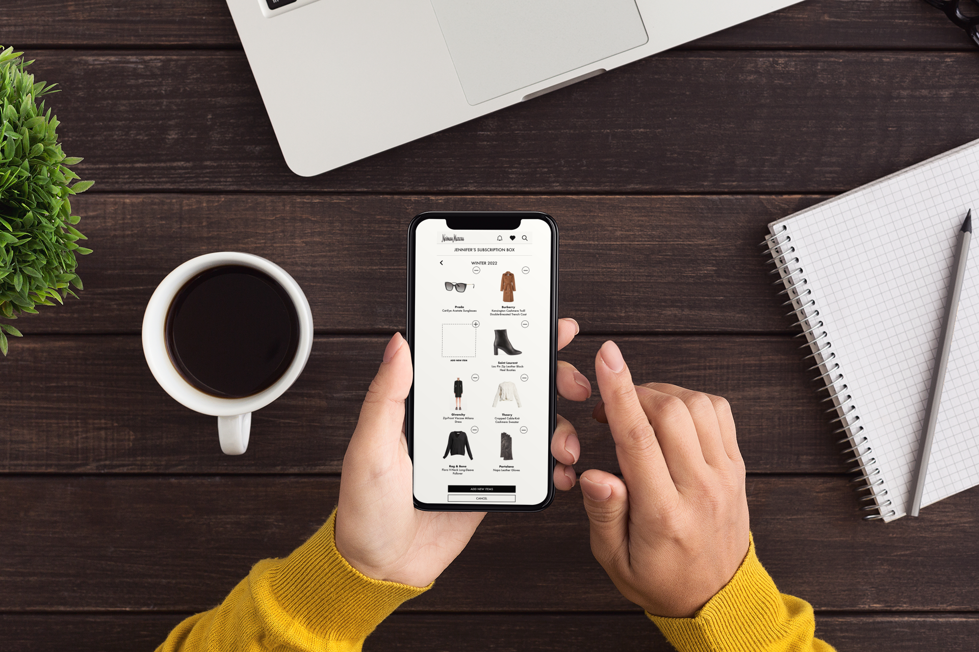
Case Study for
Neiman Marcus Concept Feature:
Premium Subscription Box
Role: User Researcher, Product Designer, User Tester
Tools: Miro, Figma
Timeline: 2 week sprint
Neiman Marcus is an American chain of luxury department stores that represent the finest and most unique merchandise the world has to offer. Their focus is on the experience of the customer when they make a purchase. The experience they want to sell is satisfaction.
As a team of 3 UX Designers we were tasked to add a new feature to NM existing mobile app. We created an exclusive premier-access subscription box service with specially curated items by a personal stylist for each customer.
This service would help each person achieve their desired looks in a timely fashion. We focused on unique looks tailored to customers’ specific needs helping them feel great.
“People love Neiman Marcus. So how can we create an even deeper emotional connection? Our selling associates do that so well every day, so how do we invest in technology that enables them to do that more?”
Bob Kupens, EVP, Chief Product & Tech Officer Neiman Marcus Group
Neiman Marcus recently filed for Chapter 11 bankruptcy and are closing stores nationally. Additionally, they never fully recovered from the ‘08-’09 recession, and have continued to struggle as a result of COVID-19.
There is a current shift in the transactional economy toward relationship driven interactions. A subscription service allows a company to build a customer’s relationship with a brand by using a recurring touchpoint- a subscription box!
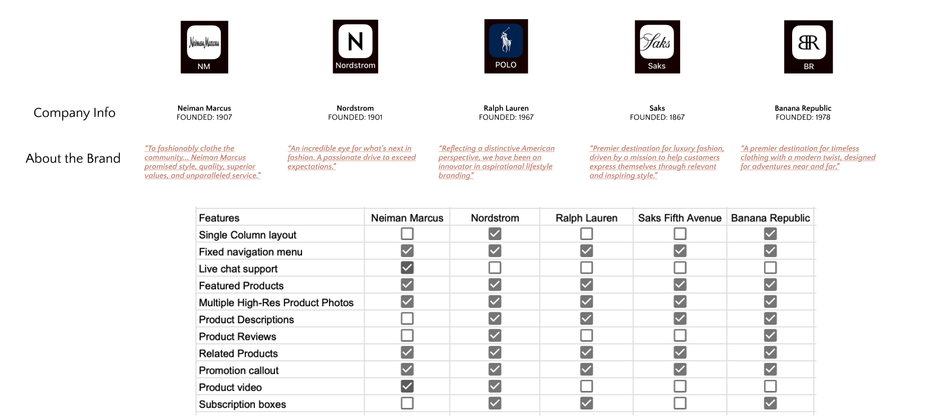
We built ourselves a Gantt chart and directed our focus on some market research. After identifying key direct competitors in the luxury department store space, we completed a task analysis on each brand’s mobile app, including Neiman Marcus.*
To learn insights about our competing brands, we conducted competitive analysis for particular features and feelings evoked by the design solutions of NM’s competitors. Compared to other brands, NM’s interface portrays a minimalistic vibe, a clean layout but the mobile site does not seem optimized for mobile.
There are several subscription options available in the market today, including Trunk Club by Nordstrom and Rent the Runway. We wanted to determine how our subscription box would stand out when compared to similar options. A comparative analysis highlighted some usability issues and flaws in the potential UX design we were brainstorming. By studying the overall state of the market, we were able to determine particulars for the NM Subscription box design.
Define
Design
Develop
To learn about how NM’s potential and prospective customers’ shopping experience and empathize with our main user segments, we conducted user interviews. We chose participants for these interviews based on user experience, whether they currently subscribed to subscription boxes and other criteria to help us examine our demographic for future input into creating our user personas.
After affinity mapping, we sorted the insights we received from user interviews into three categories. Gains, Pains and Jobs. What do users want to achieve in their shopping experience? What obstacles exist in accomplishing the tasks they are trying to get done? What key jobs need to be achieved expressed in their own words?
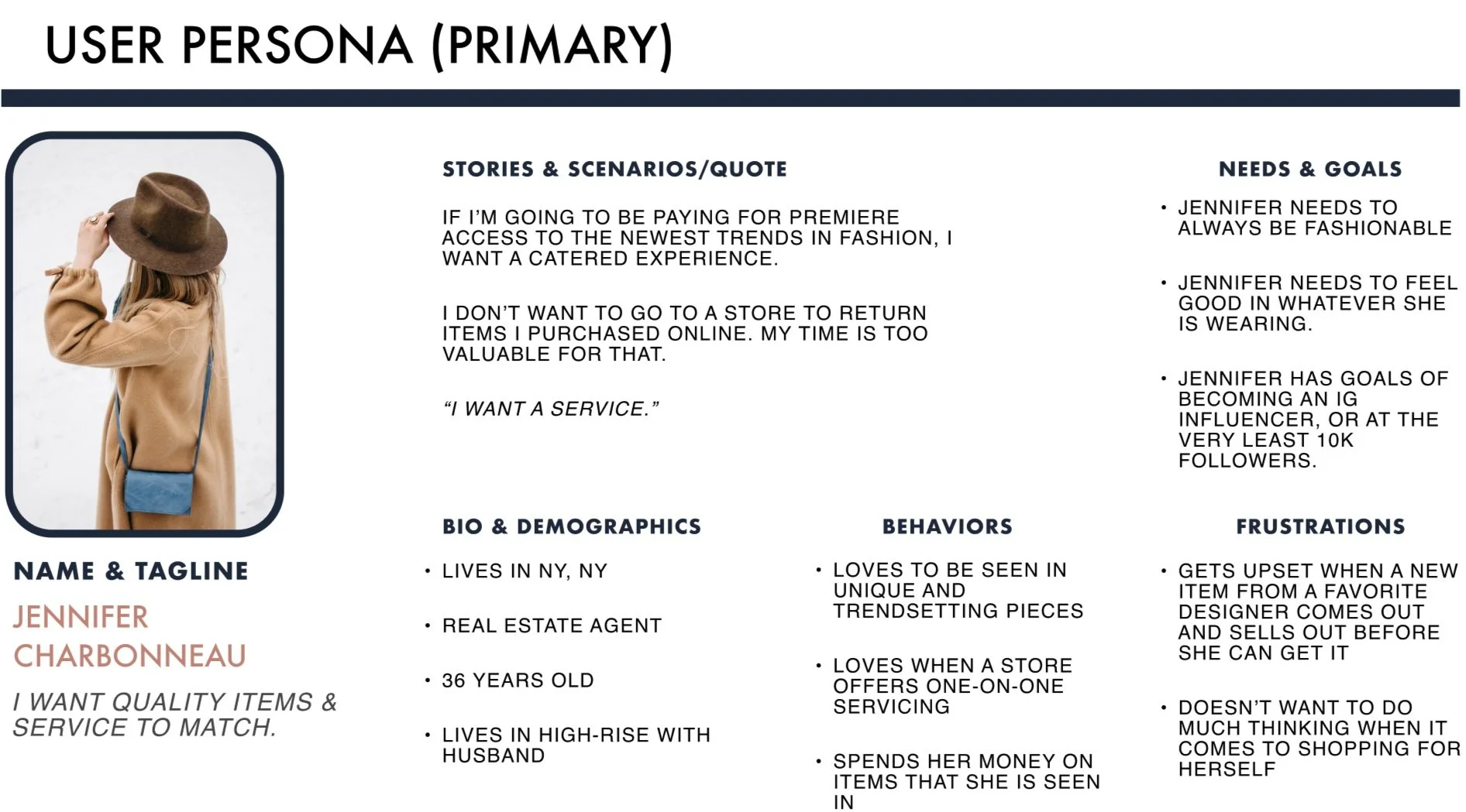
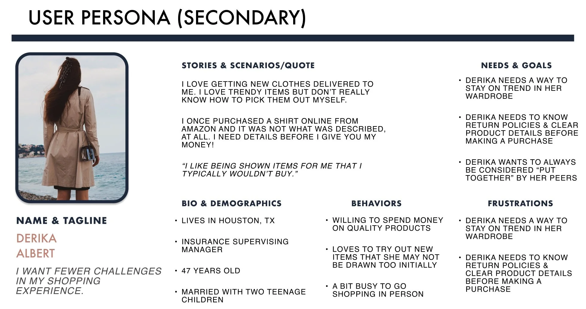
Users wanted fewer challenges, they wanted to be surprised and rewarded for their investments, they wanted real options catered to their style. They wanted quality items & service and fewer challenges in their shopping experience.
Jennifer is highly-individualistic and a decisive shopper—she knows what she wants in her clothes and accessories without cost being a barrier. However, these items are in such demand, that an issue arises with being able to snag those desirable items before everyone else. There’s an opportunity to offer customers with exclusive windows to view and purchase new luxury items, thus retaining happy, loyal customers.
Derika is looking to update her current style, but isn’t sure how to start or where to look. This means she is open to trying new things, but doesn’t want to spend much time shopping and often gets decision fatigue. There’s an opportunity to take the guess-work out of shopping, thus freeing up valuable time to our customers.
We prioritized our gains, pains and jobs in order of importance and we learned a few things about who we are designing for:
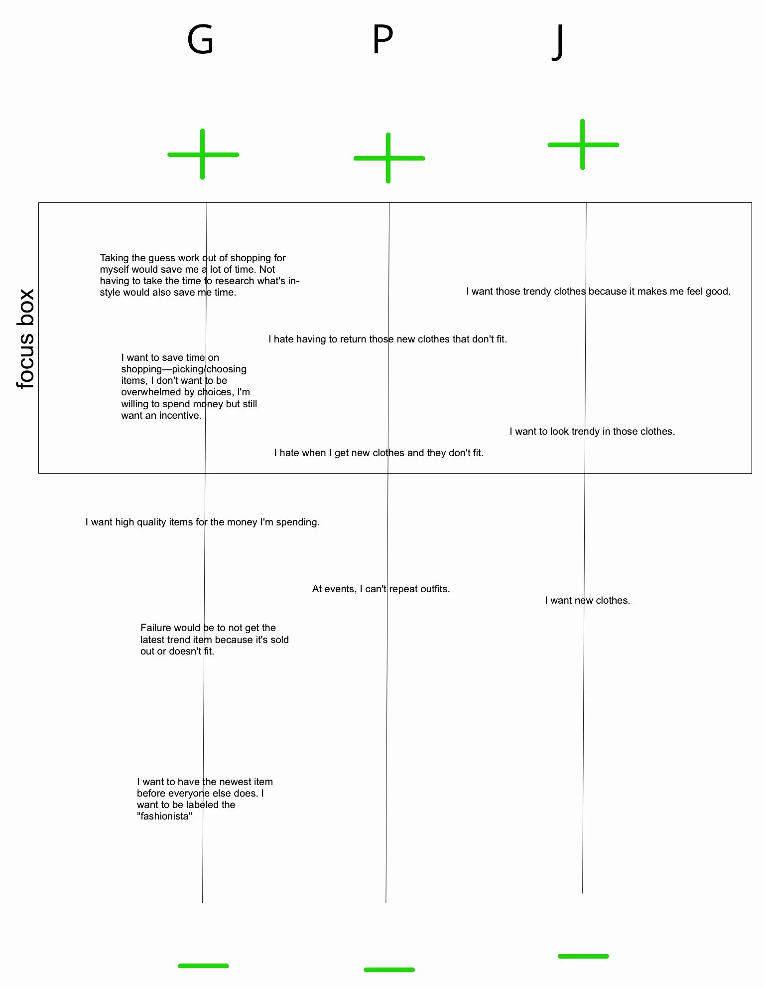
Our users wanted to take the guess work out of shopping. They want to save time on shopping. They hate returning things due to a bad return process. Trendy clothes feel good on them.
From our prioritization chart we were able to distinguish what are the most important needs were to our customer.
We brainstormed and ranked features and found out that our customers want: preferences and options that allowed them to customize their wardrobe, saved personal style, getting items that match their personal style, a hassle-free way to return clothes, essentially, a subscription service that recommends new clothes based on the newest trends & styles of their choice.
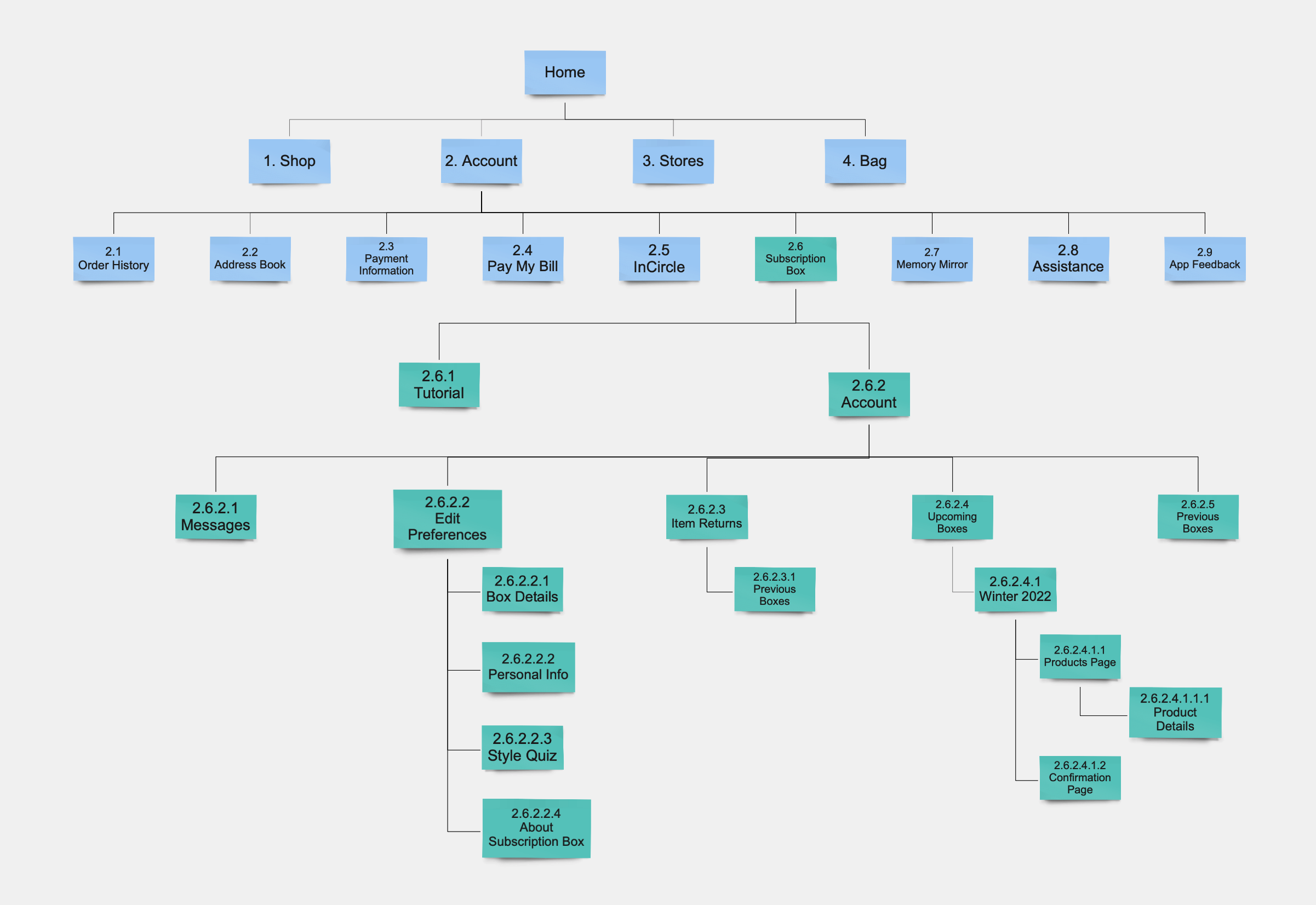
We explored information architecture ideas through site map iterations.
We asked questions: How might we help our customer feel better about their individual tastes? How might we find a unique look to be ahead of the trends? How might we help the customer find valuable items?
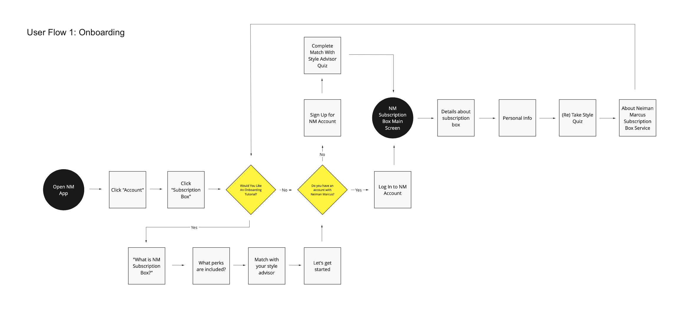
To understand and help us create the ideal shopping experience for an Neiman Marcus customer, we created user flows which displayed the complete path a user takes when learning about the new feature, personalizing their experience by sharing preferences, returning an item, and using the new featured subscription box.
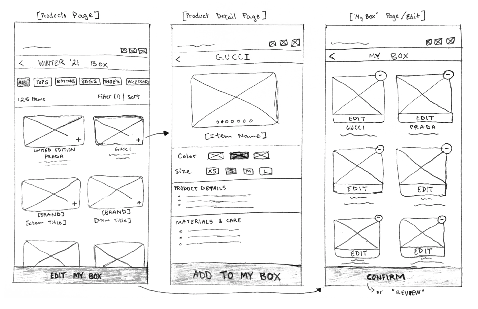
Sketching and Wireframes
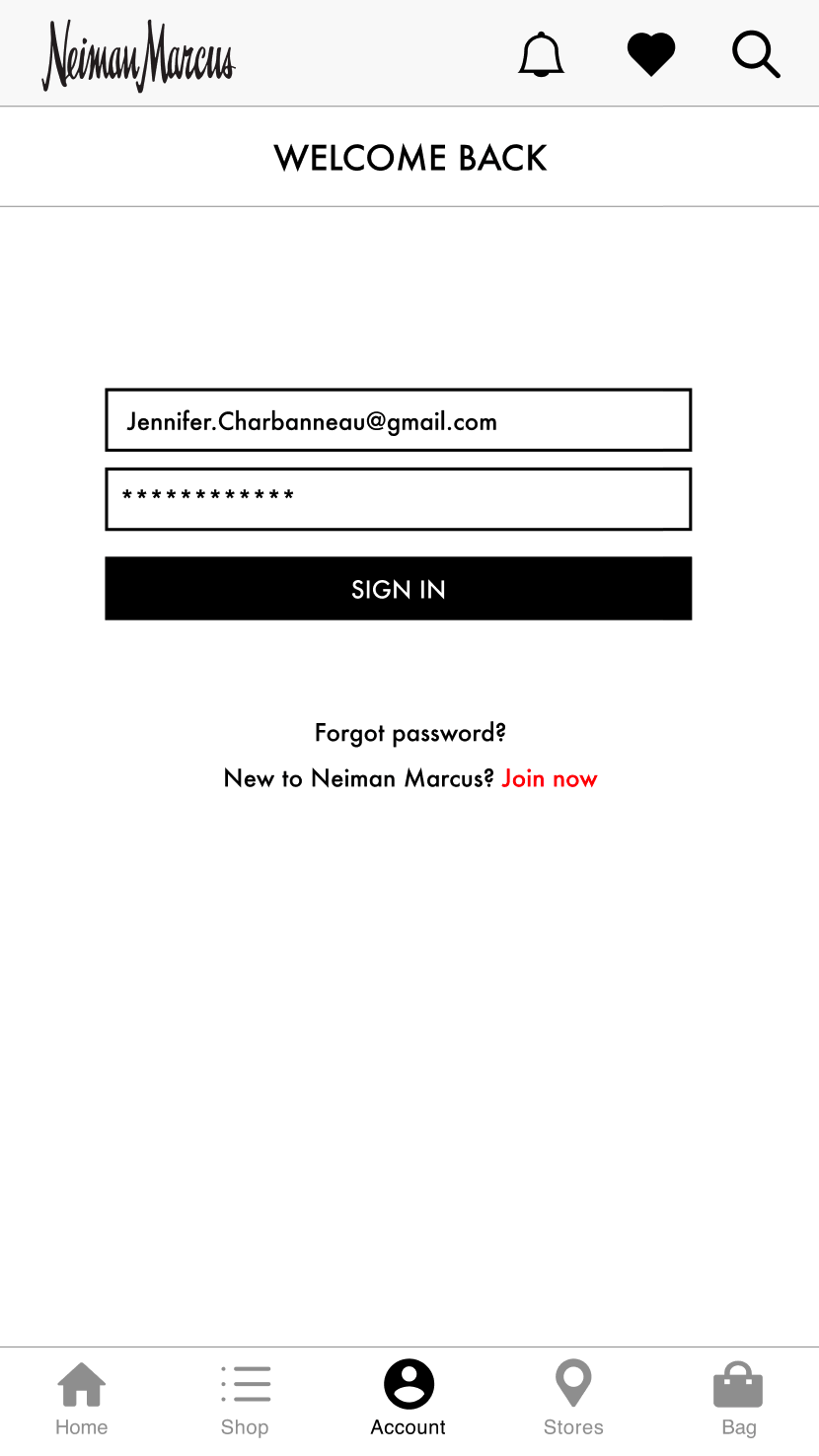
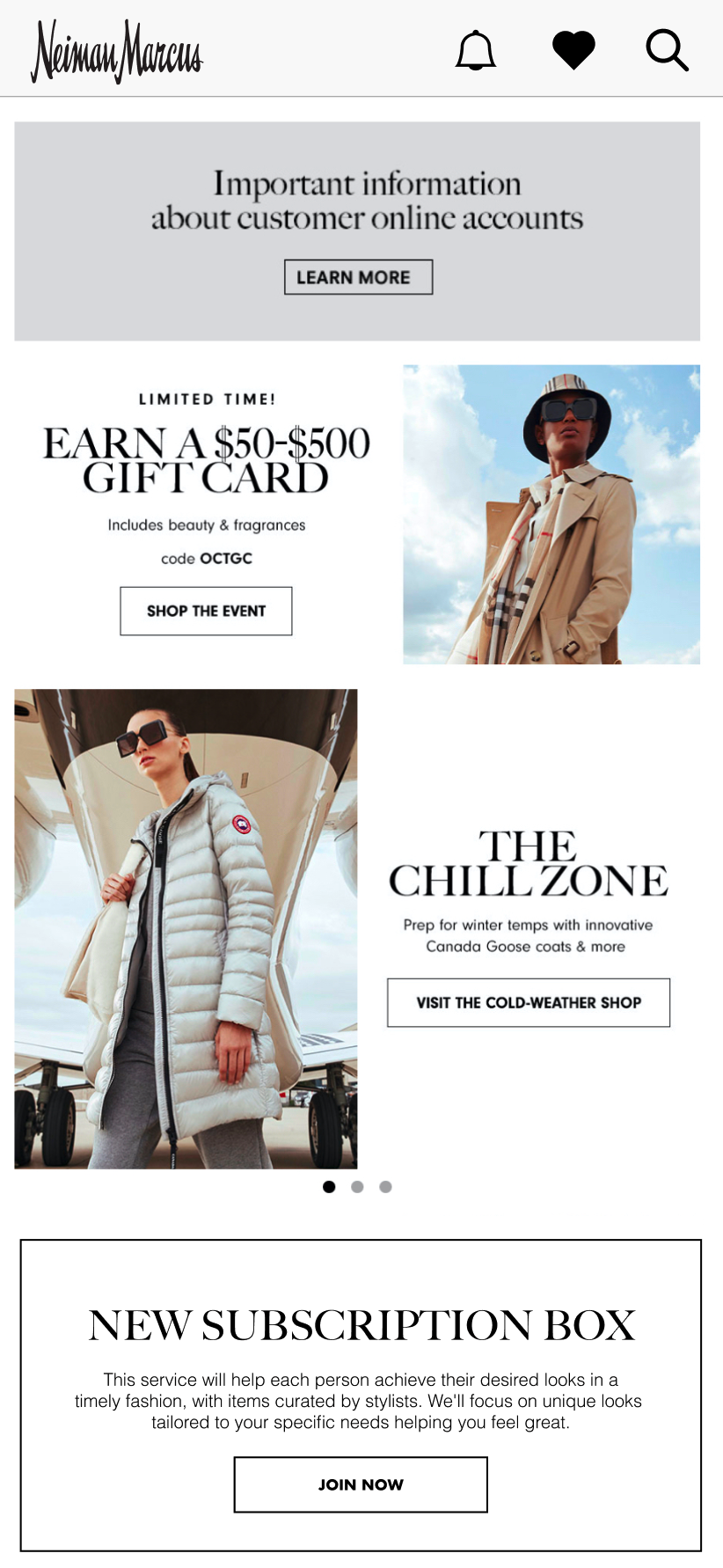
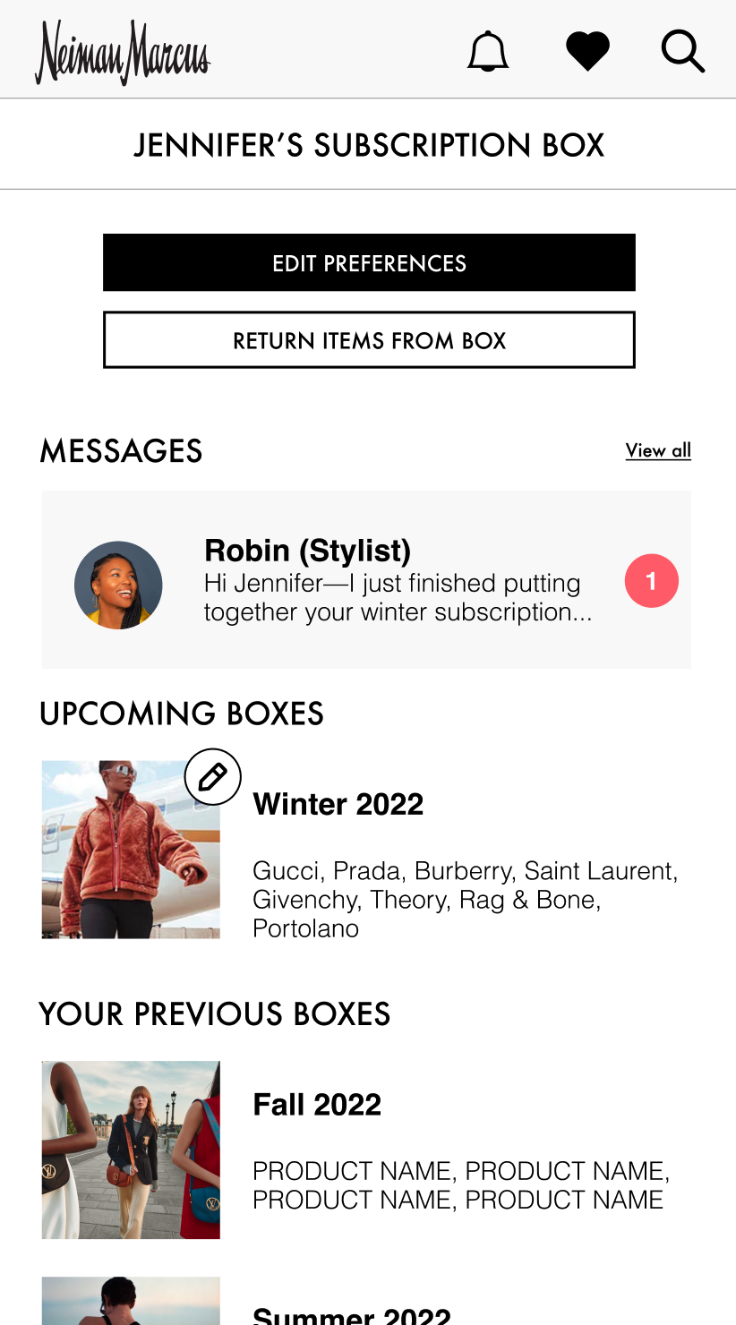
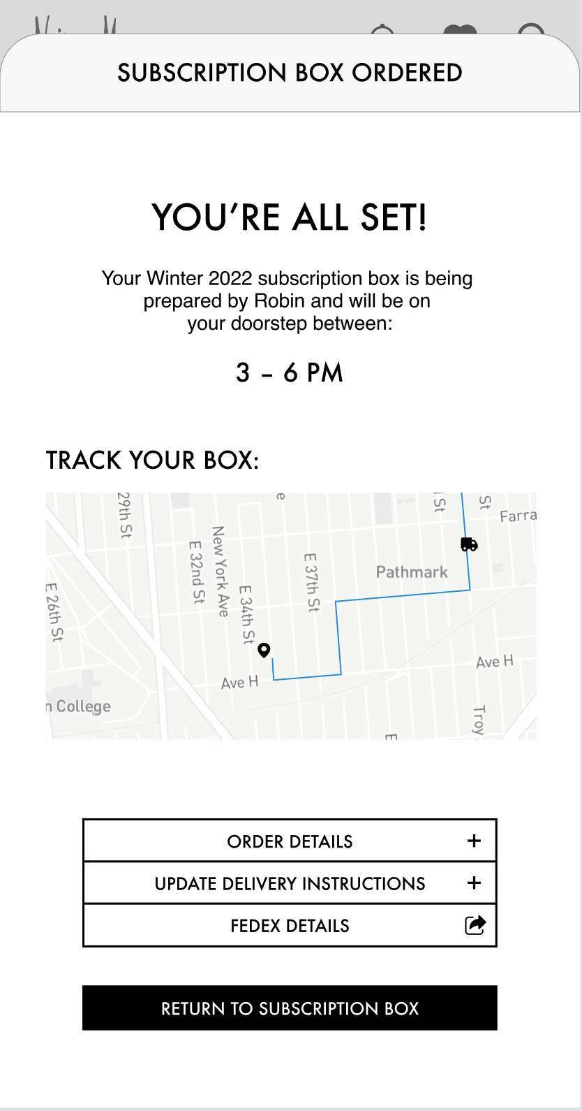
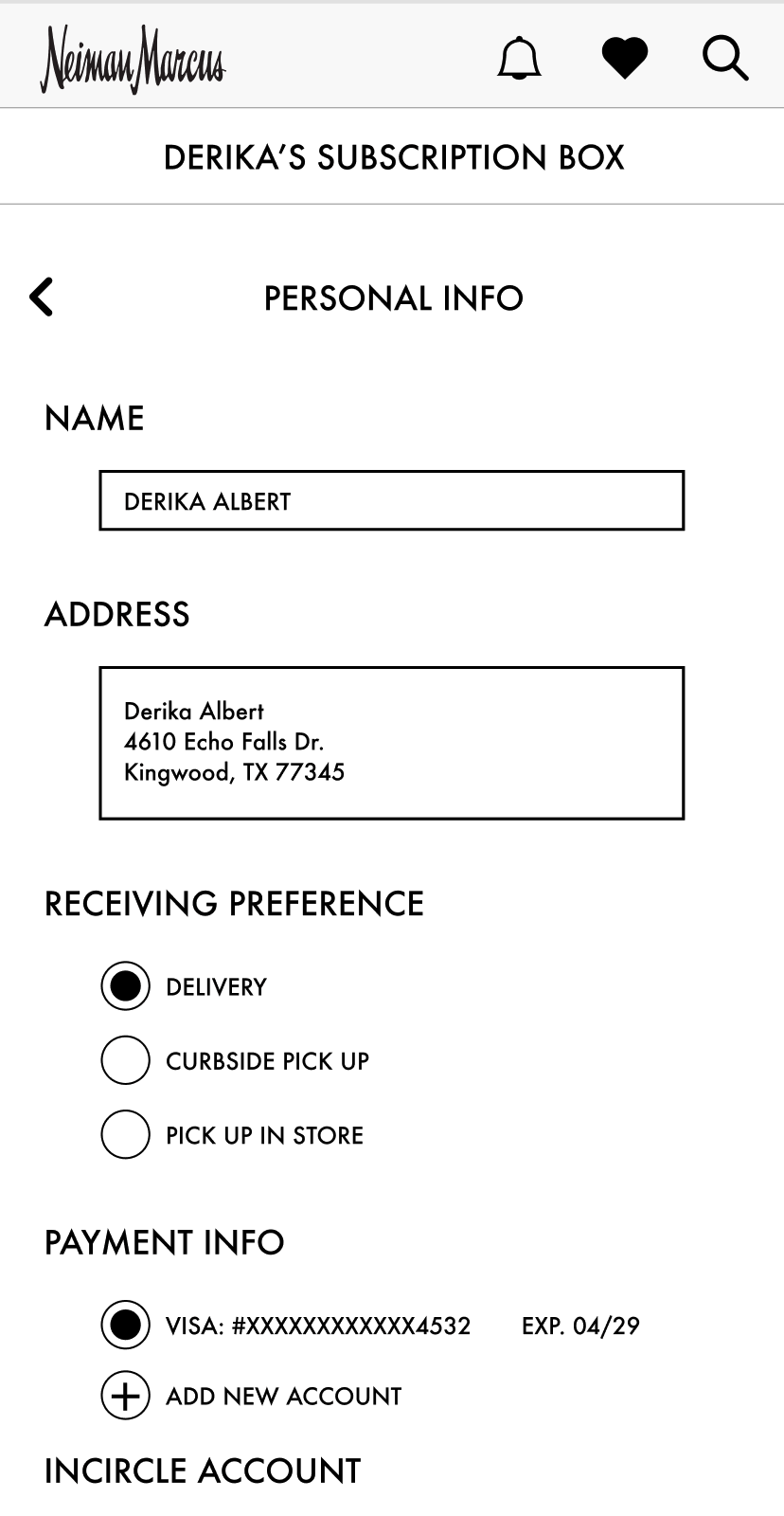
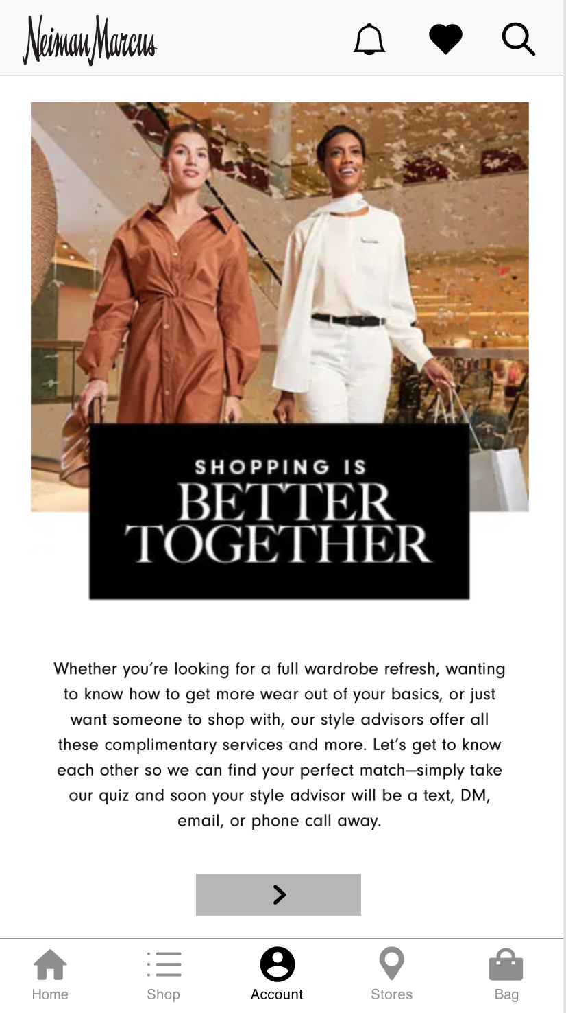
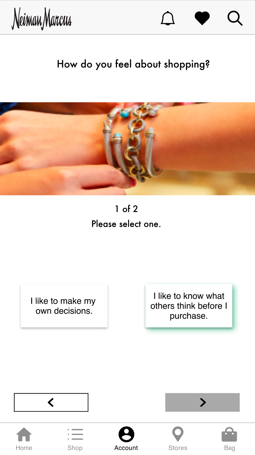
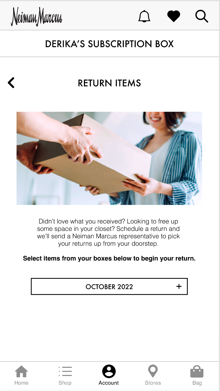
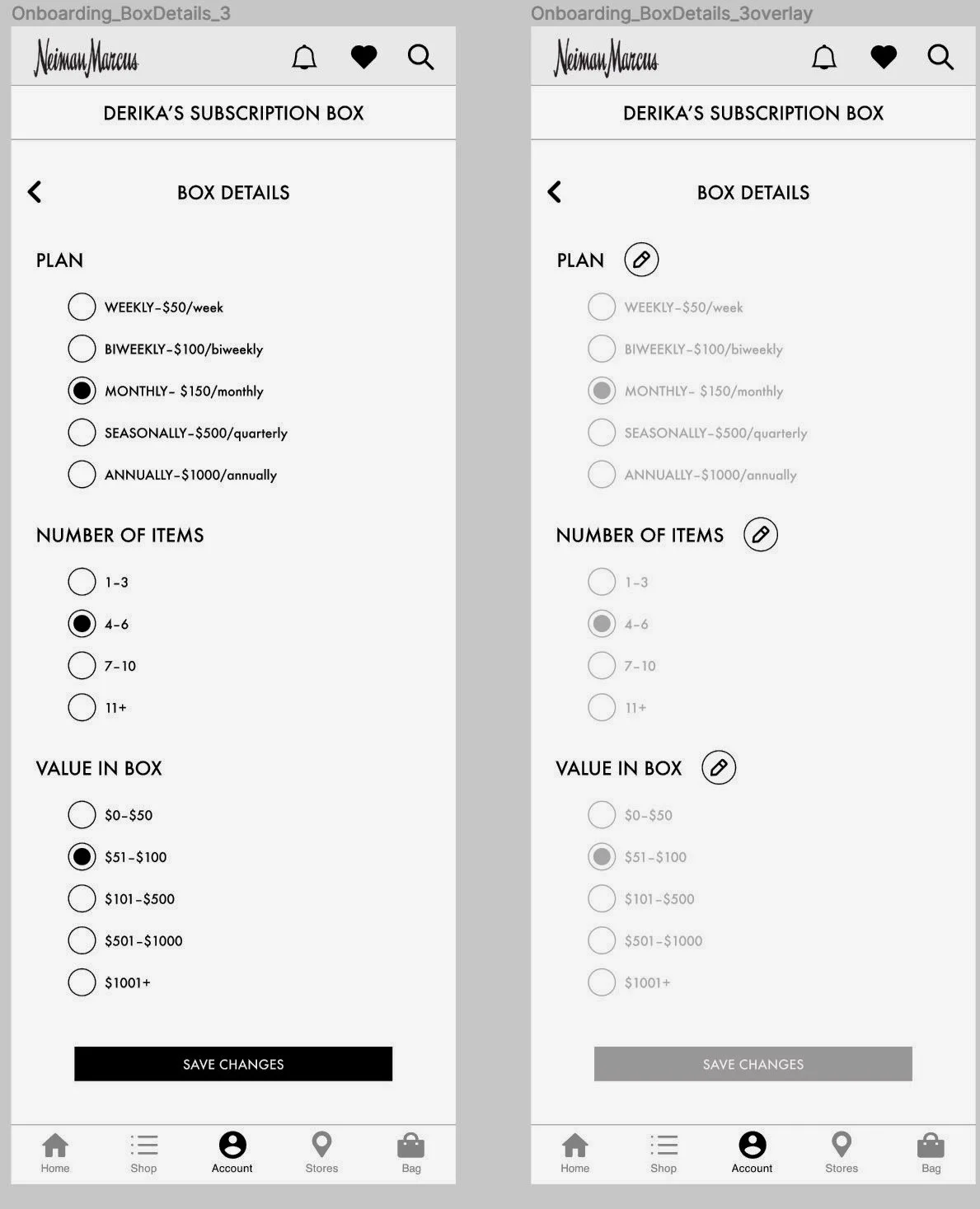
We began the design process with sketches, we visualized the ideal design for each user flow, and decided on one through multiple iterations. Wireframing these sketches showed us the path between pages by connecting the site’s architecture to its visual design. Being in a team of three, it brought us all to the same page. It clarified a consistent way of displaying information on the current NM app user interface. Our style guides, helped us make intentional choices in design decisions as a team.
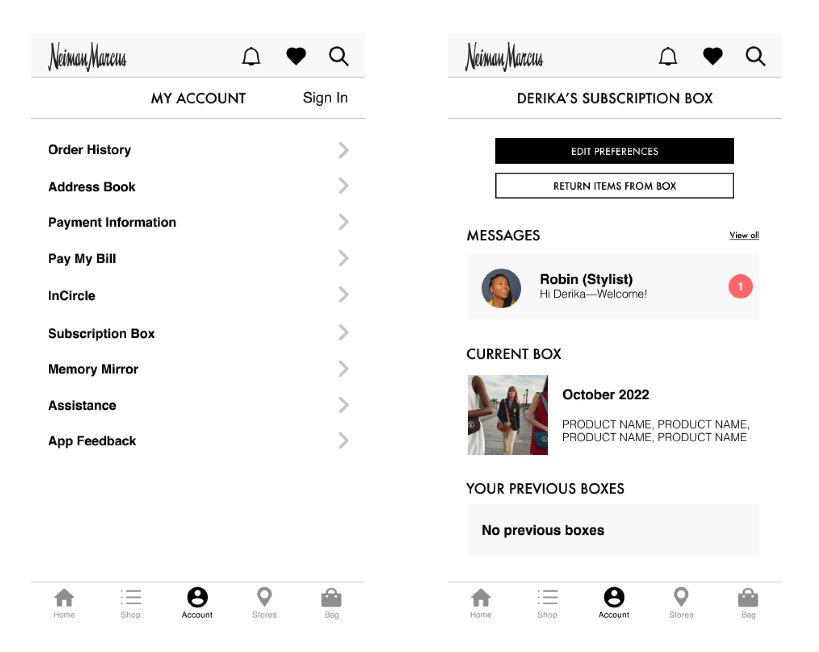
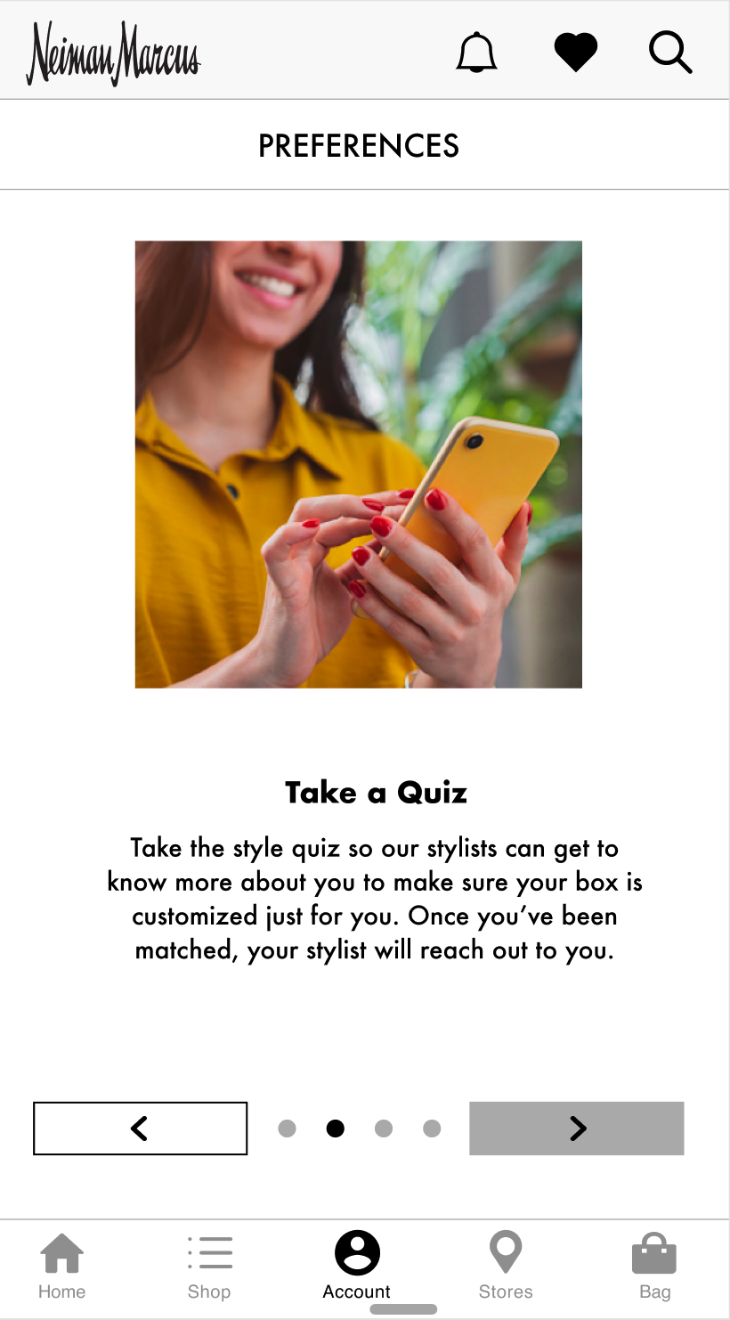
With high fidelity wireframes, we built a clickable prototype designing with Figma.

Testing and Next Steps
Using this newly designed prototype we tested the app with testers recruited from our participant base. Users were tasked to perform three flows with 9 total tasks.
Tests were moderated over Zoom, including at least two members from the team to lead and observe. Through these tests, we were able to determine functionality in the interface.
We made iterations in our design based on user insight and sus surveys. We learned that we had the potential of adding a lot more features that added to the quality of a NM subscription box user experience.
Some of our future iterations could include improved integration within the NM ecosystem, include themed-boxes, marketing and testing for a potential subscription feature name and adding implementing algorithim based components within the interface.
As of June 2021, Neiman Marcus is investing in intensive digital strategy and has already implemented technology and digital solutions to elevate its luxury customer experience.
These newly acquired acquisitions will be allocated to redirect attention towards creating a more emotional experience for customers through one of a kind experience and products.
By introducing a subscription box feature for Neiman Marcus we have offered customers an exciting personalized shopping experience which saves time, energy and creates optimal ease in experience.
Thank you for your time.